Just a little comparison I did this morning. I placed montana sapphire (navy blue) round rivoli jewels near some teardrops, one of them opaque black, one vivid aqua blue. It’s just interesting how the eye perceives these.
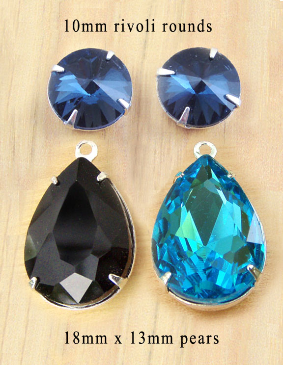
The combo on the left, with the opaque black teardrops, feels a little more Goth. The combo on the right, a little more fun and frivolous. That’s before we think about it. After we take time to reflect, we simply see the colors that match the definitions of “navy”, “black”, “aqua” (or turquoise).
But at first? Goth. Somber. And frivolous.
The brain is an interesting organ, yknow?