I get a kick out of reading the “color trends” for each season. They’re fun to read, and if you’re in retail, they can be handy indicators of what colors you’re going to want in your store.
But it’s a con game, too.
Pantone is generally regarded as the most reputable trend-projector. Here’s a link to their Color Trends for Fall 2012. The colors include “French Roast” (brown); “Honey Gold” (which is, well, gold), “Tangerine Tango” (orange), “Pink Flambe” (deep pink), “Ultramarine Green” (deep teal-ish green), “Olympian Blue” (rich deep blue), and “Titanium” (gray).
And as a comparison, here’s the report for Pantone’s Color Trends for Fall 2011. The colors include “Coffee Liqueur” (brown); “Bamboo” (gold), “Emberglow” (dusty orange-y coral), “Honeysuckle” (deep pink), “Deep Teal” (deep teal!), and “Quarry” (bluish-gray).
And, in Fall 2010: Color Trends for Fall 2010. For that season, the colors included “Chocolate Truffle” (brown); “Golden Glow” (gold), “Living Coral” (dusty coral), “Lagoon” (turquoise-ish teal!), and “Oyxter Gray” (gray).
I haven’t mentioned each color for each season – just some examples. You’re probably noticing a trend.
The professionals are projecting that these will be among the really hot colors for the upcoming Fall 2012 Retail Season:
Well, duh.
They’ve said that each year for like, every season you’ve probably been alive. Or as long as Pantone’s been listened to. And of course brown and gray and deep green or blue are going to be popular for Fall.
My point?
1. It’s not the colors that are “new” – it’s the NAMES of the colors.
2. Semantics, semantics, semantics, and did I mention marketing?
3. Trends = marketing = sales.
So stop worrying about it. Go with what looks good to YOU. Somebody will have a name for it that IS the “color of the season”.
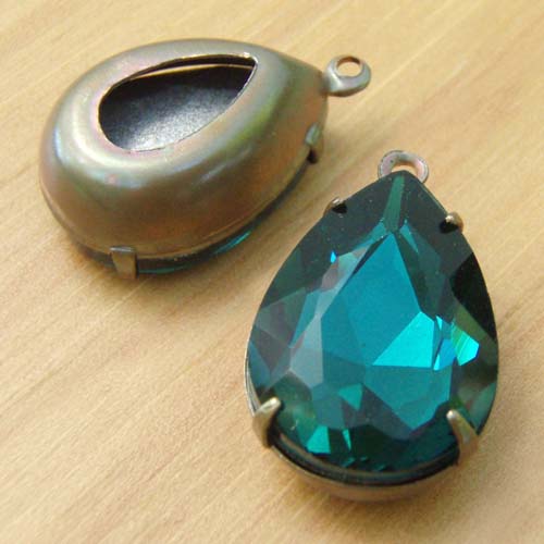
And hey, you tell me. Are these pear jewels “Ultramarine Green” or are they not? Am I on trend, or what?

Yeah, like I said 🙂